Efficiently mapping with ggplot2
Sunday, 06 August 2017
Motivation
If you have used R and ggplot2 to make maps, then you have likely noticed R can really slow down when it comes to printing larger shapefiles (be it printing to screen or saving to a file). The file sizes can also get rather large. I recently came across an excellent tool for speeding up this process substantially: the R package rmapshaper, which is based upon the mapshaper.org website.
Shapefiles
If you are not super familiar with these shapefile objects, the main thing to keep in mind is that a shapefile is simply a collection of points. If you have a shapefile of US counties, then the individual points jointly compose polygons. The polygons jointly make up the countries. The order and the grouping of these points matter. You can also have simpler shapefiles that represent lines or point, rather than polygons. If you need/want to learn more, there are many online resources. You can also check out my notes from a section I TA-ed at Berkeley.
Playing with shapefiles
Alright, let’s dive in.
Setup
First, let’s set up. I’m going to load a bunch of packages that I will eventually use for loading the shapefile (rgdal), manipulating the spatial data (broom and rmapshaper), working with the point data (data.table), and plotting (ggplot2 and viridis). I’m also going to set some options and define directories.
# Options
options(stringsAsFactors = F)
# Load packages
library(pacman)
p_load(rgdal, broom, rgeos, maptools, rmapshaper, data.table,
  magrittr, lubridate, ggplot2, viridis)
# Define the data directories
dir_research <- "/Users/edwardarubin/Dropbox/Research/"
dir_spatial <- paste0(dir_research, "MyProjects/NaturalGas/DataSpatial/")
dir_shp <- paste0(dir_spatial, "gz_2010_us_050_00_500k")
The directory dir_shp points to a folder that contains the Census’s definitions of US counties as of 2010. You can download the original shapefile from the Census.
Load/subset
Let’s load the shapefile.
# Download/load US shapefile
# TODO
us_shp <- readOGR(dsn = dir_shp, layer = "gz_2010_us_050_00_500k")
## OGR data source with driver: ESRI Shapefile
## Source: "/Users/edwardarubin/Dropbox (University of Oregon)/Research/myProjects/NaturalGas/DataSpatial/gz_2010_us_050_00_500k", layer: "gz_2010_us_050_00_500k"
## with 3221 features
## It has 6 fieldsTo improve visualization, I am going to drop Alaska, Hawaii, and Puerto Rice using subset().
Simplify
Now for the fireworks.
The package rmapshaper provides some great tools for working with spatial data—we’re currently interested in ms_simplify(). The function’s description is fairly sparse, but it gives the general idea: ms_simplify() “[u]ses mapshaper to simplify polygons.” What does that mean? Put simply: the function is going to (intelligently) sample the points from the polygons that make up a shapefile.
Why do we want to sample from the points? Some shapefiles offer resolutions much higher than you need while creating figures for papers/slides/print-outs. You probably want the high-resolution shapefiles when performing spatial analyses with the shapefiles, but when you are making pretty maps, you can save yourself a lot of time and memory by simplifying your shapefiles.
You might also wonder why we need a special function for sampling points, when base R has the capability to sample. rmapshaper utilizes mapshaper, which attempts to intelligently sample the points from the polygons so that the polygons’ shapes are fairly well preserved even with lower resolution.
The ms_simplify() function accepts several arguments. I am going to focus on the keep argument, which tells the function which percentage of the points we would like to keep. I’m going to try 1 percent, 5 percent, 10 percent, and 25 percent.
Time to sample.
# Simplify the shapefile with 'ms_simplify', keeping 1%
us01_shp <- ms_simplify(us_shp, keep = 0.01, keep_shapes = T)
## Warning in sp::proj4string(sp): CRS object has comment, which is lost in output; in tests, see
## https://cran.r-project.org/web/packages/sp/vignettes/CRS_warnings.html# Simplify the shapefile with 'ms_simplify', keeping 5%
us05_shp <- ms_simplify(us_shp, keep = 0.05, keep_shapes = T)## Warning in sp::proj4string(sp): CRS object has comment, which is lost in output; in tests, see
## https://cran.r-project.org/web/packages/sp/vignettes/CRS_warnings.html# Simplify the shapefile with 'ms_simplify', keeping 10%
us10_shp <- ms_simplify(us_shp, keep = 0.10, keep_shapes = T)## Warning in sp::proj4string(sp): CRS object has comment, which is lost in output; in tests, see
## https://cran.r-project.org/web/packages/sp/vignettes/CRS_warnings.html# Simplify the shapefile with 'ms_simplify', keeping 25%
us25_shp <- ms_simplify(us_shp, keep = 0.25, keep_shapes = T)## Warning in sp::proj4string(sp): CRS object has comment, which is lost in output; in tests, see
## https://cran.r-project.org/web/packages/sp/vignettes/CRS_warnings.htmlConvert to data table
Now that we have our sampled shapefiles, let’s convert them to data tables and then plot them with ggplot2. This extra step of converting the shapefiles to data tables (or, more generally, data frames) is necessary if you want to use ggplot(). If you want to stick with plot(), then you don’t need to convert.
For the task of converting from shapefile to data table, I am going to use the tidy() function from the broom package.
# Convert shapefiles to data tables
# 'tidy' each of the shapefiles for plotting with 'ggplot'
us01_dt <- tidy(us01_shp, region = "GEO_ID") %>% data.table()
## Warning in RGEOSUnaryPredFunc(spgeom, byid, "rgeos_isvalid"): Self-intersection
## at or near point -101.32551391 40.00268689## SpP is invalid## Warning in rgeos::gUnaryUnion(spgeom = SpP, id = IDs): Invalid objects found;
## consider using set_RGEOS_CheckValidity(2L)## Warning in RGEOSUnaryPredFunc(spgeom, byid, "rgeos_isvalid"): Self-intersection
## at or near point -101.32551391 40.00268689## SpP is invalid## Warning in rgeos::gUnaryUnion(spgeom = SpP, id = IDs): Invalid objects found;
## consider using set_RGEOS_CheckValidity(2L)## Warning in RGEOSUnaryPredFunc(spgeom, byid, "rgeos_isvalid"): Self-intersection
## at or near point -101.32551391 40.00268689## SpP is invalid## Warning in rgeos::gUnaryUnion(spgeom = SpP, id = IDs): Invalid objects found;
## consider using set_RGEOS_CheckValidity(2L)## Warning in RGEOSUnaryPredFunc(spgeom, byid, "rgeos_isvalid"): Self-intersection
## at or near point -84.363215999999994 32.397649000000001## Warning in RGEOSUnaryPredFunc(spgeom, byid, "rgeos_isvalid"): Self-intersection
## at or near point -84.305204000000003 31.691058000000002## Warning in RGEOSUnaryPredFunc(spgeom, byid, "rgeos_isvalid"): Self-intersection
## at or near point -101.32551391 40.00268689## SpP is invalid## Warning in rgeos::gUnaryUnion(spgeom = SpP, id = IDs): Invalid objects found;
## consider using set_RGEOS_CheckValidity(2L)Compare numbers
Now, let’s compare the number of points in each of the data tables, starting with the 1-percent sample and moving all the way up to the full shapefile.
# Compare the dimensions of each tidied shapefile
lapply(
  X = list(us01_dt, us05_dt, us10_dt, us25_dt, us_dt),
  FUN = dim)
## [[1]]
## [1] 47105 7
##
## [[2]]
## [1] 76752 7
##
## [[3]]
## [1] 113718 7
##
## [[4]]
## [1] 228134 7
##
## [[5]]
## [1] 794693 7Notice that the 1-percent sample actually has about 6 percent of the points of the original sample. Why? Likely due to the fact that we asked ms_simplify() to preserve shapes (keep_shapes = T), which attempted to keep small polygons from disappearing.
Compare graphs
Finally, let’s compare the sampling results for the one-percent sample and the full sample. For the sake of visualization, I am going to start by focusing on the great state of Nebraska (FIPS code 31).
# Plot
ggplot() +
  geom_path(data = us_dt[grepl("[U][S][3][1]", group)],
    color = plasma(2, end = 0.95)[1],
    aes(x = long, y = lat, group = group)) +
  geom_path(data = us01_dt[grepl("[U][S][3][1]", group)],
    color = plasma(2, end = 0.95)[2],
    aes(x = long, y = lat, group = group)) +
  xlab("") + ylab("") +
  ggtitle("Comparing the 1-percent sample and the full shapefile") +
  theme_minimal() +
  theme(
    axis.ticks = element_blank(),
    axis.text = element_blank(),
    panel.grid.major = element_blank(),
    panel.grid.minor = element_blank()
    ) +
  coord_map("conic", 41)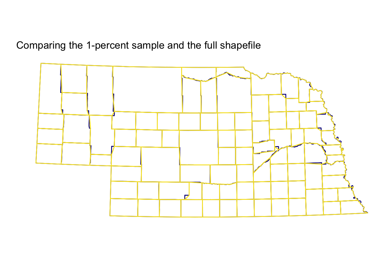
Not bad, eh? The 1-percent sample (plotted on top in yellow) cuts a few corners, but on the whole, it’s quite accurate relative to the full shapefile (the bottom layer in dark blue)—you definitely get the picture, which is probably the point of visualization. This use case (counties in Nebraska) may be particularly nice for the function, since many counties in Western-ish states like Nebraska are quite rectangular. You can see the 1-percent sample does a bit worse around Nebraska’s eastern edge, where the border is defined by the meandering Missouri River, rather than latitudes and longitudes.
Now let’s zoom out to the whole country.
# Plot
ggplot() +
  geom_path(data = us_dt,
    color = plasma(2, end = 0.95)[1],
    aes(x = long, y = lat, group = group)) +
  geom_path(data = us01_dt,
    color = plasma(2, end = 0.95)[2],
    aes(x = long, y = lat, group = group)) +
  xlab("") + ylab("") +
  ggtitle("Comparing the 1-percent sample and the full shapefile") +
  theme_minimal() +
  theme(
    axis.ticks = element_blank(),
    axis.text = element_blank(),
    panel.grid.major = element_blank(),
    panel.grid.minor = element_blank()
    ) +
  coord_map("conic", 22.5)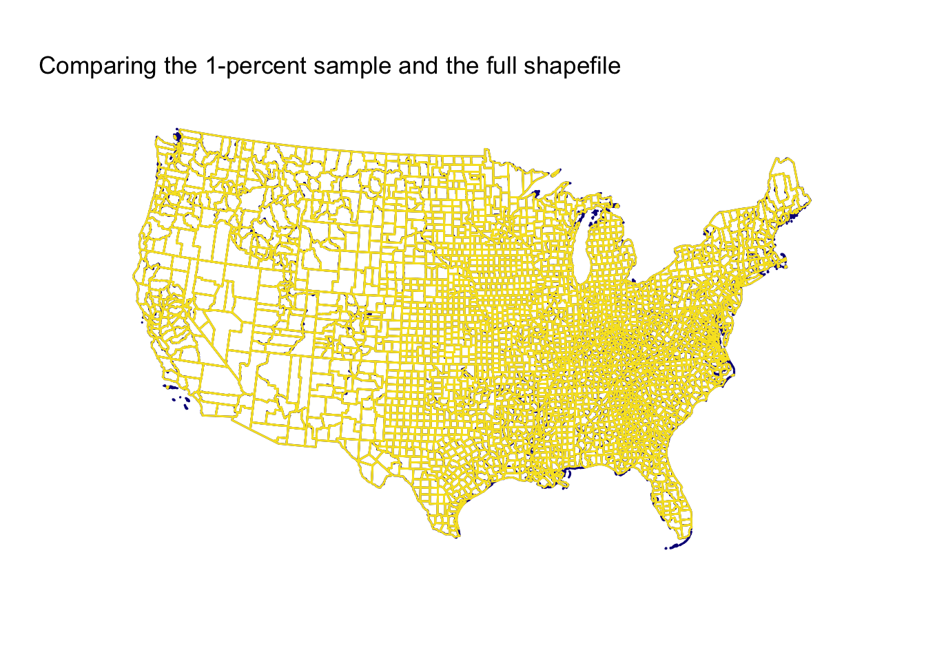
Still pretty pretty good! Keep in mind, this comparison is between a 1-percent sample and the full sample. The 1-percent sample is missing some islands and struggles a bit on peninsulas/coasts, but overall, I’d say it is pretty good.
Before we quit, let’s check out the other samples.
First, the five-percent sample.
# Plot
ggplot() +
  geom_path(data = us_dt,
    color = plasma(2, end = 0.95)[1],
    aes(x = long, y = lat, group = group)) +
  geom_path(data = us05_dt,
    color = plasma(2, end = 0.95)[2],
    aes(x = long, y = lat, group = group)) +
  xlab("") + ylab("") +
  ggtitle("Comparing the 5-percent sample and the full shapefile") +
  theme_minimal() +
  theme(
    axis.ticks = element_blank(),
    axis.text = element_blank(),
    panel.grid.major = element_blank(),
    panel.grid.minor = element_blank()
    ) +
  coord_map("conic", 22.5)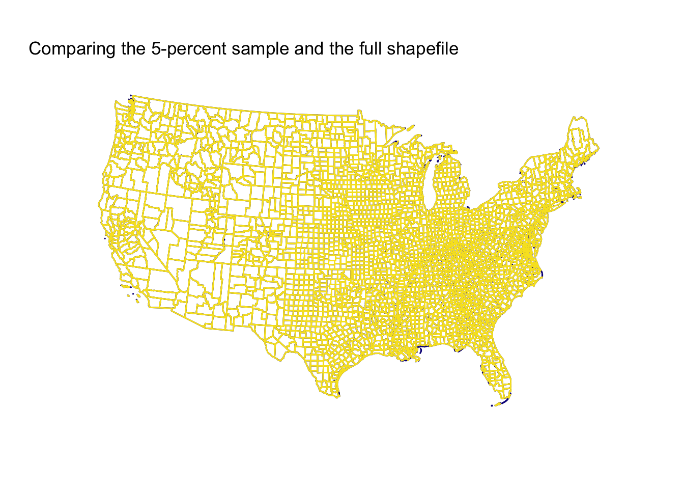
Now, the ten-percent sample.
# Plot
ggplot() +
  geom_path(data = us_dt,
    color = plasma(2, end = 0.95)[1],
    aes(x = long, y = lat, group = group)) +
  geom_path(data = us10_dt,
    color = plasma(2, end = 0.95)[2],
    aes(x = long, y = lat, group = group)) +
  xlab("") + ylab("") +
  ggtitle("Comparing the 10-percent sample and the full shapefile") +
  theme_minimal() +
  theme(
    axis.ticks = element_blank(),
    axis.text = element_blank(),
    panel.grid.major = element_blank(),
    panel.grid.minor = element_blank()
    ) +
  coord_map("conic", 22.5)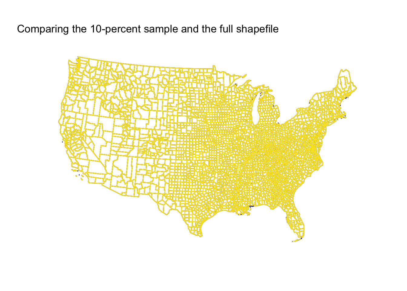
Finally, the twenty-five percent sample.
# Plot
ggplot() +
  geom_path(data = us_dt,
    color = plasma(2, end = 0.95)[1],
    aes(x = long, y = lat, group = group)) +
  geom_path(data = us25_dt,
    color = plasma(2, end = 0.95)[2],
    aes(x = long, y = lat, group = group)) +
  xlab("") + ylab("") +
  ggtitle("Comparing the 25-percent sample and the full shapefile") +
  theme_minimal() +
  theme(
    axis.ticks = element_blank(),
    axis.text = element_blank(),
    panel.grid.major = element_blank(),
    panel.grid.minor = element_blank()
    ) +
  coord_map("conic", 22.5)
Conclusion
The 1-percent sample surprised me in how well it performed, but again, this result is (1) a function of the simplicity of the original polygons and (2) the original shapefile’s resolution. The 5-percent and 10-percent samples do better (unsurprisingly), and the 25-percent sample is essentially indistinguishable from the full shapefile.
Finally, while I’ve mainly used this sampling to make maps, I imagine there are people using it for many other applications.
Enjoy!