Section 12b: Spatial data, continued
Admin
Announcements
See the notes for Section 13.
What you will need
Packages:
- New:
ggmapandleaflet(andraster, though we loaded it last week) - Old:
lubridate,rgdal,raster,broom,rgeos,GISTools,dplyr,ggplot2,ggthemes,magrittr, andviridis
Data:
- The file chicagoNightLights.tif
- The folder ChicagoPoliceBeats, which contains the shapefile of Chicago’s police beats.
- The file chicagoCrime.rds
Spatial data, continued
These notes continue our discussion of spatial data, which we began in Section 12. We split the world of spatial data into two broad categories: vector data and raster data. We’ve already covered vector data—focusing on (1) a shapefile composed of polygons that represent Chicago’s police beats and (2) a points file representing police-reported crimes in Chicago. Now we will turn to raster data.
Raster data
As I mentioned previously, raster data are grids with values assigned to the squares within the grid.1 A major difference between rasters and vectors: vectors are composed of discrete elements throughout space, whereas rasters are defined continuously through space. Although you still end up with non-continuous movement in the values between cells, you can think of a raster as the interpolation of a field (variable) that is constant through space. A common example is temperature. Every point on Earth’s surface has a temperature. And guess what… you can get temperature rasters.2 Other examples? Air quality/pollution, property values, land cover, elevation, and population (sort of).
R setup
Let’s set up R and then dive in.
# General R setup ----
# Options
options(stringsAsFactors = F)
# Load new packages
pacman::p_load(ggmap, leaflet)
# Load old packages
pacman::p_load(lubridate, rgdal, raster, broom, rgeos, GISTools)
pacman::p_load(dplyr, ggplot2, ggthemes, magrittr, viridis)
# My ggplot2 theme
theme_ed <- theme(
  legend.position = "bottom",
  panel.background = element_rect(fill = NA),
  # panel.border = element_rect(fill = NA, color = "grey75"),
  axis.ticks = element_line(color = "grey95", size = 0.3),
  panel.grid.major = element_line(color = "grey95", size = 0.3),
  panel.grid.minor = element_line(color = "grey95", size = 0.3),
  legend.key = element_blank())
# My directories
dir_12 <- "/Users/edwardarubin/Dropbox/Teaching/ARE212/Spring2017/Section12/"
dir_12b <- "/Users/edwardarubin/Dropbox/Teaching/ARE212/Spring2017/Section12b/"
Loading rasters
We need a raster.3 I’ve decided we are going to look a small subset of the (in)famous night(time) lights dataset.4 You can download the night lights data in various ways, but they are all fairly large—like 520 million cells large. I’ve cropped the original night lights raster (for January 2017) so that it covers the Chicago area with a little room to spare.5
Let’s read in this raster (named chicagoNightLights.tif). For this task, we will use the raster() function from the raster package.6 We will also load the police beats shapefile that we used in the previous section.
# Read the Chicago lights raster
chi_lights <- raster(paste0(dir_12b, "chicagoNightLights.tif"))
# Read the Chicago police beats shapefile
chi_beats <- readOGR(paste0(dir_12, "ChicagoPoliceBeats"), "chiBeats")
## OGR data source with driver: ESRI Shapefile
## Source: "/Users/edwardarubin/Dropbox/Teaching/ARE212/Spring2017/Section12/ChicagoPoliceBeats", layer: "chiBeats"
## with 277 features
## It has 4 fieldsAs was the case with vectors (shapefiles), we can quickly and easily plot rasters using R’s base plot() function. Again, this frequent plotting—particularly after loading a new file—is a good policy that helps you avoid errors and better understand what you are looking at/doing. Once again, I am going to use the virids package (and function) for its color palette.
# Plot the Chicago night lights raster
plot(chi_lights, col = viridis(1e3))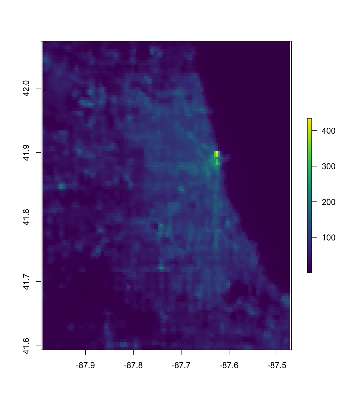
Now that we’ve plotted the raster, let’s plot the police beats shapefile over the raster, using the base lines() function. You could also use plot() here with the additional argument add = T. The lwd argument specifies the width of the lines.
# Plot the Chicago night lights raster
plot(chi_lights, col = viridis(1e3))
# Plot the police beats over the night lights raster
lines(chi_beats, col = "white", lwd = 0.8)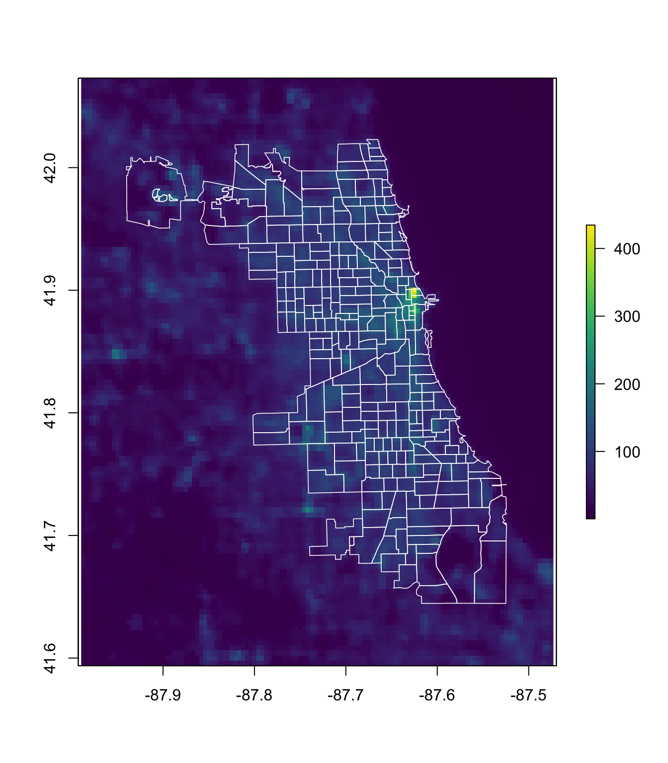
Great.7 So what’s next?
Raster parts
Before we get too far ahead of ourselves, let’s learn a little about how we can access the different parts of a raster. If you check the names() of our raster, you will find it is simply the name of the file that provided the raster. Unlike shapefiles, we will not learn too much using the slots. Instead, we will use specific functions from the raster package. If you want to access the values of the raster, you can use the values() function or the getValues() function. If you want to change the values within a raster, you should use the setValues() function. Finally, if you want to access the coordinates of the raster’s grid, use the coordinates() function. Examples:
# R's description of the raster
chi_lights
## class : RasterLayer
## dimensions : 115, 124, 14260 (nrow, ncol, ncell)
## resolution : 0.004166667, 0.004166667 (x, y)
## extent : -87.98958, -87.47292, 41.59375, 42.07292 (xmin, xmax, ymin, ymax)
## coord. ref. : +proj=longlat +datum=WGS84 +no_defs +ellps=WGS84 +towgs84=0,0,0
## data source : /Users/edwardarubin/Dropbox/Teaching/ARE212/Spring2017/Section12b/chicagoNightLights.tif
## names : chicagoNightLights
## values : 0.3693645, 434.6022 (min, max)# R's summary of the raster
chi_lights %>% summary()## chicagoNightLights
## Min. 0.3693645
## 1st Qu. 9.7078307
## Median 33.2180634
## 3rd Qu. 67.7126541
## Max. 434.6021729
## NA's 0.0000000# The slot names
chi_lights %>% slotNames()## [1] "file" "data" "legend" "title" "extent" "rotated"
## [7] "rotation" "ncols" "nrows" "crs" "history" "z"# The first 6 values
chi_lights %>% getValues() %>% head()## [1] 25.68902 22.61487 26.09766 28.05734 39.12275 47.22555# The first six coordinates
chi_lights %>% coordinates() %>% head()## x y
## [1,] -87.98750 42.07083
## [2,] -87.98333 42.07083
## [3,] -87.97917 42.07083
## [4,] -87.97500 42.07083
## [5,] -87.97083 42.07083
## [6,] -87.96667 42.07083A histogram of the raster’s values (logged):
ggplot(data = data.frame(light = getValues(chi_lights)),
  aes(x = log(light))) +
  geom_histogram(bins = 20, fill = viridis(20)) +
  ylab("Count") +
  xlab("log(radiance)") +
  ggtitle("Distribution of light radiance near Chicago",
    subtitle = "January 2017, logged radiance") +
  theme_ed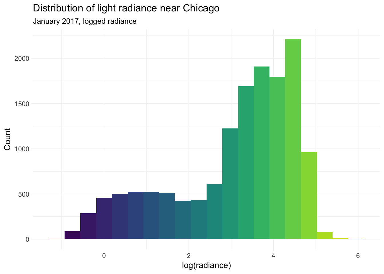
It’s worth noting that this histogram includes a lot of low light due to Lake Michigan. I took the log of the radiance to get a bit more dispersion in the histogram.
Summarize rasters with polygons
We generally want to take some sort of summary statistics of our raster. Often, we want these summary statistics at the level of some other spatial object—either a polygon or a point. Let’s see how this summarization works for polygons. Specifically, let’s take the average level of light within each of police beats in our police beat shapefile. For this task—and similar tasks—the raster package’s extract() function is your best friend.8 The extract() function wants the following arguments:
x: the raster from which you want to extract valuesy: the points at which you would like to extract values; in the current context,yis our shapefile, but it could also be lines or pointsfun: the function we will use to summarize the raster (here:mean)na.rm: do you want to remove missing values (NAs)?df: (optional) do you want a data frame (rather than a matrix)sp: (optional) do you want the outputted results attached the thedataslot ofy(requires theyis anspobject, i.e., spatial polygons or spatial lines.)
Because we would end up joining the results of extract() to our spatial polygons data frame (chi_beats), I will go ahead and specify sp = TRUE.
You can also apply extract() over multiple layers of raster stack. Our current raster has one layer, but you will often find multi-layer rasters called raster stacks (or raster bricks). Similar objects but with more layers.9
Important note: The extract() function does not always do what you think it is going to do. It is written to be fairly flexible, which means it needs to make decisions. Some of the decisions the function must make:
- What counts as being in a polygon? Must the center of the cell be in the polygon, or is it enough that any part of the cell intersects the polygon?
- If you require the center of the cell to be within the polygon, what happens when a polygon does not intersect with any cells’ centroids?
- Should all cells count equally, or should we weight by the amount of the cell covered by a polygon?
Many of these questions are especially relevant/important when your cells are large relative to your polygons. This is not the case in our current example. Unfortunately, it is often the case in real research.
Alight, let’s summarize our night lights raster by taking the mean within each police beat. Finally, because we loaded the magrittr package after we loaded raster package—and because both packages have a function named extract()—raster’s version of extract has been masked by magrittr’s version. Thus we need to reference the raster package when we call extract(), i.e., raster::extract().
# Take averages of lights raster within each police beat
beat_extract <- raster::extract(
  x = chi_lights,
  y = chi_beats,
  fun = mean,
  na.rm = T,
sp = T)Note: extract() can take a little while—particularly when you have a high-resolution raster (many cells in given area) and many, high-resolution polygons.
Summarizing rasters with points
Now let’s carry out a similar task but with points rather than polygons.
First, we need some points. We’ll load the crime locations that we used in our discussion of vector data. And clean them.
# Read crime points data file
crime_df <- readRDS(paste0(dir_12, "chicagoCrime.rds"))
# Convert to tbl_df
crime_df %<>% tbl_df()
# Change names
names(crime_df) <- c("id", "date", "primary_offense",
  "arrest", "domestic", "beat", "lat", "lon")
# Drop observations missing lat or lon
crime_df %<>% filter(!is.na(lat) & !is.na(lon))
# Take subset of crimes
crime_df %<>% subset(primary_offense %in% c("HOMICIDE", "NARCOTICS"))
# Convert dates
crime_df %<>% mutate(date = mdy_hms(date))
# Define longitude and latitude as our coordinates
coordinates(crime_df) <- ~ lon + lat
# Assing a CRS to the crime points data
proj4string(crime_df) <- crs(chi_beats)
# Take the union of the beats polygons
chicago_union <- gUnaryUnion(chi_beats)
# Check which crime points are inside of Chicago
test_points <- over(crime_df, chicago_union)
# From 1 and NA to T and F (F means not in Chicago)
test_points <- !is.na(test_points)
crime_df <- crime_df[which(test_points == T), ]
Now we use extract() again, this time applying it so that we get a value from the raster at each of our crime-based points in crime_df.
crime_extract <- raster::extract(
  x = chi_lights,
  y = crime_df,
  fun = mean,
  na.rm = T,
  sp = T)
Rasters in ggplot2
So how does one plot a raster with ggplot2? As with spatial vector data, the problem is that ggplot() wants a data-frame-like object, and the raster is not a data-frame-like object. Lucky for us, raster provides the function rasterToPoints(), which does exactly what its name suggests: it creates a matrix of coordinates and values from a raster.10 Let’s create a data frame from the night lights data and then plot it in ggplot2 using the geom_raster() function.
# Convert raster to matrix and then to data frame
lights_df <- chi_lights %>% rasterToPoints() %>% tbl_df()
# Plot with ggplot
ggplot(data = lights_df,
  aes(x = x, y = y, fill = chicagoNightLights)) +
  geom_raster() +
  ylab("") + xlab("") +
  ggtitle("Lights at night in Chicago",
    subtitle = "January 2017") +
  scale_fill_viridis(option = "D") +
  theme_ed +
  theme(legend.position = "none", axis.text = element_blank())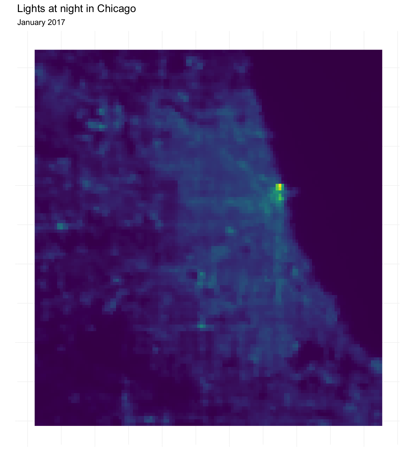
Masks
You may have noticed that our raster includes many locations that are not within Chicago’s police beats. The crop() function will only crop the raster to the extent of the police beats shapefile, so we will still end up with a rectangle with many grid squares outside of the polygons.
The mask() function offers a solution to this problem. Masking means that we define any grid square in our raster not covered by some shape as NA. Thus, while we end up with the same extent as before, we now only have values for grid squares within a police beat in Chicago.
Let’s try it. Specifically, we will mask our night lights data with the outline of Chicago (chicago_union).
# Mask night lights raster with Chicago's outline
lights_masked <- mask(x = chi_lights, mask = chicago_union)
Now let’s plot our masked raster to see the result.
# Convert raster to matrix and then to data frame
masked_df <- lights_masked %>% rasterToPoints() %>% tbl_df()
# Plot with ggplot
ggplot(data = masked_df,
  aes(x = x, y = y, fill = chicagoNightLights)) +
  geom_raster() +
  ylab("") + xlab("") +
  ggtitle("Lights at night in Chicago, masked",
    subtitle = "January 2017") +
  scale_fill_viridis(option = "D") +
  theme_ed +
  theme(legend.position = "none", axis.text = element_blank())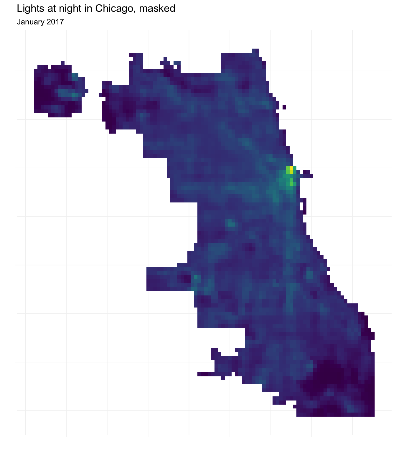
Using this masked night lights data, let’s compare the (approximate) densities of (logged) light for (1) all of Chicago, (2) homicide locations, and (3) narcotics offenses’ locations.
# Convert crime_extract to a data frame
crime_extract %<>% tbl_df()
# Density plots
ggplot() +
  geom_density(
    data = masked_df,
    aes(x = log(chicagoNightLights), color = "All of Chicago", fill = "All of Chicago"),
    alpha = 0.6) +
  geom_density(
    data = filter(crime_extract, primary_offense == "HOMICIDE"),
    aes(x = log(chicagoNightLights), color = "Homicide", fill = "Homicide"),
    alpha = 0.6) +
  geom_density(
    data = filter(crime_extract, primary_offense == "NARCOTICS"),
    aes(x = log(chicagoNightLights), color = "Narcotics", fill = "Narcotics"),
    alpha = 0.6) +
  ylab("Density") +
  xlab("Log(Light radiance)") +
  theme_ed +
  scale_color_viridis("", discrete = T) +
  scale_fill_viridis("", discrete = T)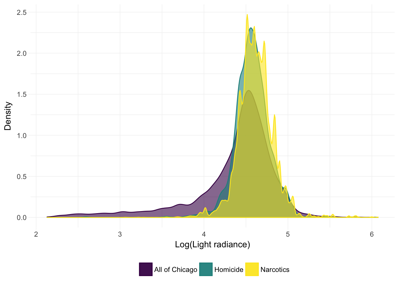
It actually looks like the crimes occur in locations with a bit more light.11 We can also check out the means:12
# Compare means
masked_df %>%
  dplyr::select(chicagoNightLights) %>%
  summary()
## chicagoNightLights
## Min. : 8.418
## 1st Qu.: 69.079
## Median : 89.395
## Mean : 87.474
## 3rd Qu.:105.267
## Max. :434.602crime_extract %>%
filter(primary_offense == "HOMICIDE") %>%
dplyr::select(chicagoNightLights) %>%
summary()## chicagoNightLights
## Min. : 13.36
## 1st Qu.: 85.61
## Median : 96.42
## Mean : 99.05
## 3rd Qu.:109.40
## Max. :434.60crime_extract %>%
filter(primary_offense == "NARCOTICS") %>%
dplyr::select(chicagoNightLights) %>%
summary()## chicagoNightLights
## Min. : 10.25
## 1st Qu.: 89.73
## Median : 99.98
## Mean :103.29
## 3rd Qu.:113.39
## Max. :434.60These numerical summaries are consistent with what we observed in the density plot above: the recorded crimes tend to happen in places that are brighter than the average point in Chicago. Of course, this observation is not causal and does not include standard errors/inference (or even a formal point estimate), so I wouldn’t recommend any policy decisions quite yet.
Creating a raster
As we’ve discussed thus far, rasters are really just grids with values assigned to the grid cells. Thus, they are fairly simple to create.
First, we need a grid. The function expand.grid() is a very nice function for creating a grid—it takes all possible combinations of the given variables and then returns an (ordered) matrix. Let’s create an 11-by-11 grid by taking all combinations of [-5, 5] and [-5, 5] (by 1).
# Creating an 11-by-11 grid
our_mat <- expand.grid(x = -5:5, y = -5:5)
# Check out the head
our_mat %>% head(10)
## x y
## 1 -5 -5
## 2 -4 -5
## 3 -3 -5
## 4 -2 -5
## 5 -1 -5
## 6 0 -5
## 7 1 -5
## 8 2 -5
## 9 3 -5
## 10 4 -5Let’s now convert the matrix to a data frame and then add a column of random numbers (standard normal).
# Convert to data frame
our_df <- our_mat %>% tbl_df()
# Set seed
set.seed(12345)
# Add random numbers
our_df %<>% mutate(value = rnorm(nrow(our_df)))
Because ggplot2 actually wants a data frame—rather than a raster—we can check our soon-to-be raster before it is finished.
# Plotting our raster data
ggplot(our_df, aes(x, y, fill = value)) +
  geom_raster() +
  ggtitle("Our (random) raster data") +
  scale_fill_viridis("Value") +
  coord_equal() +
  theme_ed +
  theme(
    legend.key.width = unit(2, "cm"),
    legend.key.height = unit(3/4, "cm"),
    panel.grid.major = element_blank(),
    panel.grid.minor = element_blank())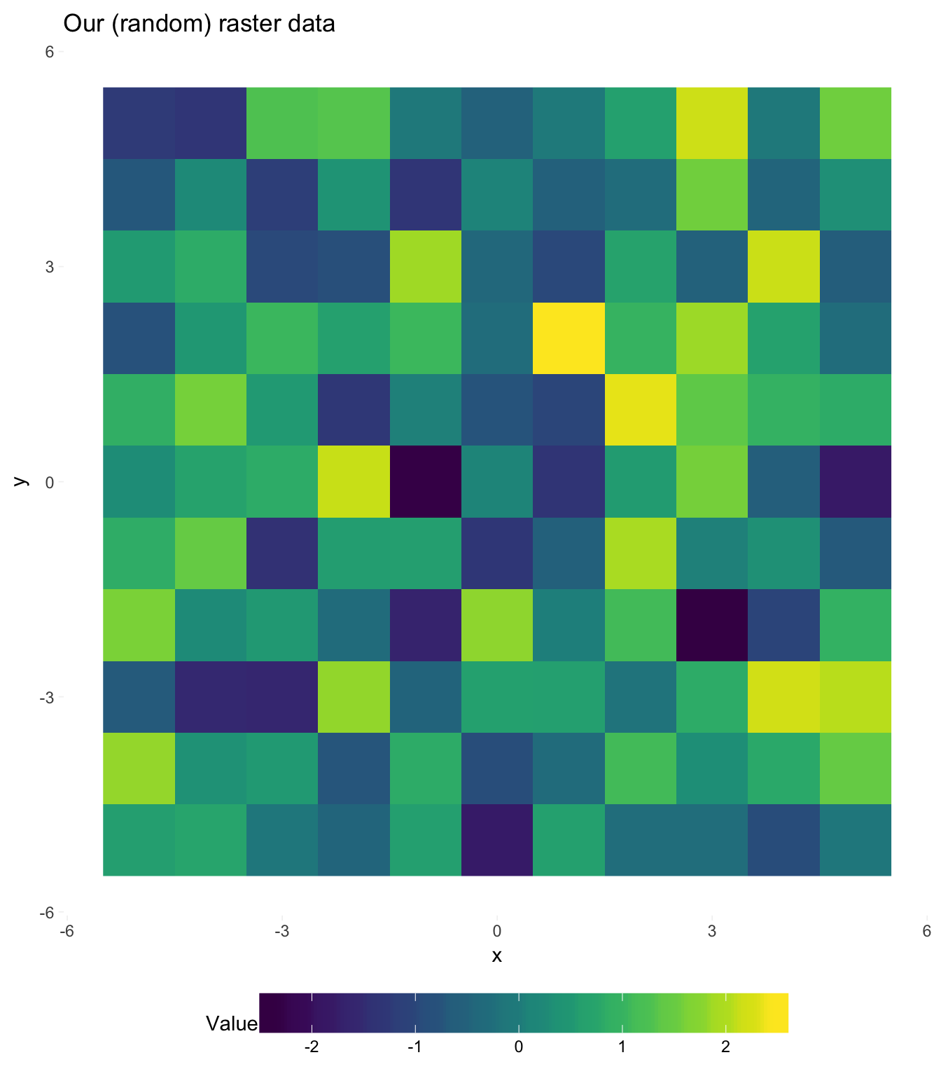
Beautiful! I think someone should make a quilt out of this bad boy.
Let’s finish converting this data frame into a raster. Once we have a data frame with coordinates and values (which we do), we can use the function rasterFromXYZ() (raster package) to convert the data frame into a raster object. rasterFromXYZ() will assume your x and y variables are the x and y coordinates. The function allows you to specify the resolution (res) and coordinate-reference system (crs), but because our raster is based in an imaginary world, we’ll ignore these arguments. rasterFromXYZ() also requires that the points are on a regular grid; if you cannot meet this requirement, see the function rasterize().
# Finish creating our raster
our_raster <- rasterFromXYZ(our_df)
# See if it worked
our_raster
## class : RasterLayer
## dimensions : 11, 11, 121 (nrow, ncol, ncell)
## resolution : 1, 1 (x, y)
## extent : -5.5, 5.5, -5.5, 5.5 (xmin, xmax, ymin, ymax)
## coord. ref. : NA
## data source : in memory
## names : value
## values : -2.380358, 2.477111 (min, max)It worked! A final check:
plot(our_raster, col = viridis(1e3),
  xlim = c(-5,5), ylim = c(-5,5))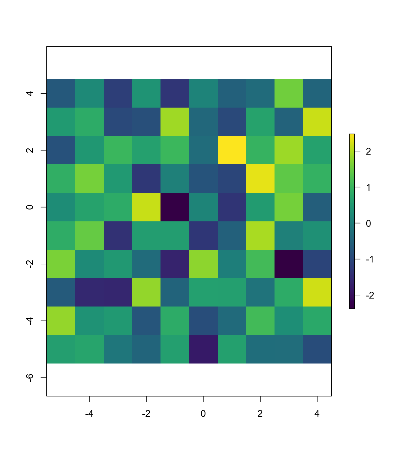
Geocoding
Geocoding presents an entirely different task from those that we have covered thus far in our tour de force of spatial data. The term geocoding refers finding the the geographic coordinates for a location (or locations). Geocoding is useful for taking addresses and finding their latitudes and longitudes so that you can use them in conjunction with other spatial datasets. (Reverse geocoding refers beginning with geographic coordinates and finding addresses.) There are many services that offer geocoding, and some are better than others—and the quality may also vary with the region of the world. The importance of quality geocoding will also vary with the spatial resolution of the other data in your research—if you are working at the county level, you don’t have to worry, as almost any geocoder will be able place a street address in the correct county. If you want to geocode several addresses, this task is referred to as batch geocoding.
There are many services/APIs that allow you to geocode, and most allow you to geocode for free up to some (moderate-ish) limit. Google maps is probably the most popular, but you will have to work with its API. ESRI (the company that makes ArcGIS) provides another popular geocoder, which you can access for free at the D-Lab. Finally, I’ve had decent success with geocodio, which has a pretty cool comparison across several geocoders and is quite easy to use, i.e., you upload a CSV file.
As you may have guessed, you can also geocode using R (and an internet connection). You have a few options; I am opting for the geocode() function from the ggmap package. The main arguments to the function are:
location: the street address (or place name) as a single character string, e.g., “123 Fake Street, Omaha, Nebraska 68043”.locationcan also be a vector of addresses.output: the amount of output that you would likesource: the source used for geocoding; either"google"for Google or"dsk"for the Data Science Toolkit
Alright, let’s try geocoding an address. We’ll give it a tricky one—the address of Giannini Hall, which is even difficult for pizza-delivery people who live in Berkeley. We will try both sources.
# Geocode with Google
geo_google <- geocode(
  "207 Giannini Hall #3310 University of California Berkeley, CA 94720-3310",
  output = "more",
  source = "google")
## Information from URL : http://maps.googleapis.com/maps/api/geocode/json?address=207%20Giannini%20Hall%20#3310%20University%20of%20California%20Berkeley,%20CA%2094720-3310&sensor=falseNote: I used to have an example here contrasting Google’s (great) geocoding of Giannini Hall with the (less-stellar but open-source) Data Science Toolkit (the source = "dsk" in the geocode() function), but I cannot currently find a working page for the Data Science Toolkit.
First, let’s see how Google did.13
geo_google## lon lat type loctype address
## 1 -122.2623 37.87358 establishment approximate berkeley, ca 94720, usa
## north south east west locality
## 1 37.87493 37.87223 -122.2609 -122.2636 Berkeley
## administrative_area_level_2 administrative_area_level_1 country
## 1 Alameda County California United States
## postal_code
## 1 94720It’s hard to tell from this print out, but it seems as though Google did well. You can at least see that Google stayed inside of the city that we gave them and identified the location as an ‘establishment.’
Let’s zoom in on Google’s geocoding.
leaflet() %>%
  addMarkers(lng = geo_google$lon, lat = geo_google$lat, popup = "Google") %>%
  addProviderTiles(providers$OpenStreetMap.HOT) %>%
  setView(lng = geo_google$lon, lat = geo_google$lat, zoom = 17)
Impressive. I’m pretty sure Google found my desk.
An important point for geocoding: You will not always get quality results, and it is really helpful to have a way to “check” your work. One way is to use several geocoding services to see if you are getting consistent results—though they may all make the same mistake.
Fun tools: Leaflet
For the maps above, I used the package leaflet. Leaflet is an awesome tool for making maps—especially if you are interested in interactive maps.14 Leaflet is actually a super popular JavaScript library used to produce interactive maps, but some folks at RStudio created the R package leaflet to allow R users to access the Leaflet library inside of R. Great, right?
If you are interested in learning more about the leaflet package, I recommend this tutorial published by its creators. You will see that it covers many of the spatial data topicsl we have covered—rasters, polygons, choropleths, etc.
As you saw above, leaflet makes use of piping in a way similar to ggplot2’s pluses (+). The syntax has a few other things in common, i.e., you begin with the leaflet() function and then continue to add (pipe) layers/objects. If you want to add markers, as I did, you use addMarkers() and provide a longitude lng, a latitude lat, and a character label for the marker popup. In order to have actual map, you need to load some map tiles. To add map tiles to your map, use addTiles(), which uses the default map tiles,15 or addProviderTiles(), which accesses map tiles from a bunch of mapping services. There are many other options, like where the map is centered, how far you want to zoom, which projections you use, etc.
As with ggplot2, you can also define your map as an object in R’s environment. I’ll leave you with six maps of the same place (Lincoln, Nebraska!) with different providers’ map tiles. I will first define a basic map without tiles, and then in each map, I will use a different set of tiles.
m <- leaflet() %>%
  addMarkers(lng = -96.6852, lat = 40.8258, popup = "Lincoln, NE") %>%
  setView(lng = -96.6852, lat = 40.8258, zoom = 12)
CartoDB:
m %>% addProviderTiles(providers$CartoDB)OpenMapSurfer’s roads map:
m %>% addProviderTiles(providers$OpenMapSurfer.Roads)OpenStreeMap’s “HOT” map:
m %>% addProviderTiles(providers$OpenStreetMap.HOT)ESRI’s “World Imagery” map:
m %>% addProviderTiles(providers$Esri.WorldImagery)ESRI’s “World Terrain” map (zoomed out):
m %>% addProviderTiles(providers$Esri.WorldTerrain) %>%
  setView(lng = -96.6852, lat = 40.8258, zoom = 4)
NASA’s “Viirs Earth At Night, 2012” map (zoomed out):
m %>% addProviderTiles(providers$NASAGIBS.ViirsEarthAtNight2012) %>%
  setView(lng = -96.6852, lat = 40.8258, zoom = 4)
This is exactly how pictures work, which is why you will sometimes see rasters in the same file formats as pictures from a camera—.jpeg, .tif, etc.↩
See NOAA, NARR, and Berkeley Earth for examples.↩
Usually, your research question will dictate which dataset you need. Here we just need a with which we can play.↩
Not really that infamous. People have been using light at night, measured by satellites, to proxy for economic development, electricity penetration, and similar topics—particularly in settings where these data are otherwise unavailable (e.g., the developing world). You might get a few eye rolls if you use these data, but they are pretty cool.↩
For this task, I used the
crop()function in therasterpackage to crop the raster and thewriteRaster()function (also from therasterpackage) to save the new, cropped raster.↩Creative naming, right?↩
If we were actually using these data for a research project, you would probably want to make sure that the shapefile and the raster match up (nearly) perfectly. They look decent, but you would probably want to spend a bit more time ensuring the projections/locations really do match. I’m going to assume they do.↩
See
?raster::extractfor more information on the function.↩You could also accomplish this task using the
getValues()andcoordinates()functions.↩I’m looking at the thicker lower tail for All of Chicago.↩
I’m not logging here. Apologies for being inconsistent.↩
You are restricted to 2500 queries to Google each day.↩
Unfortunately, there is currently little opportunity for interactive maps in the world of academic economics.↩
I had problems here.↩